 Front Room: Basically, it's a narrow living room and a diningroom that is being used as a "music room".
 Fix its:
The burgundy furniture is very small for the space.
The wall above the sofa was covered in a multiple of frames and similar shaped things so that it all ran together.
The ficus trees. With Christmas lights and assorted ornaments on it. Had to go. Oh and the rocking horse.

After:
Well, we only took one pic of the front room, and it's the same view the realtor's photographer used.
We took all that stuff off the shelves and added larger scale items instead to fill the space.
Replaced the ficus with a more narrow tree, removed the sewing spindle,
the small chest, and angled the sofa and chair (which I have no pic of, darn it.)
We also replaced the small clock with a larger one,
took down all the family photos that lined the wall to the Left of the clock,
and replaced it with a tapestry.
Cleared the staircase landing completely.
I would've loved to have had an area rug in the front room to frame it,
but they didn't own one and were on a budget.
The only view of the dining/piano room.
It was minimally cluttered,
mostly on the walls,
so we hung a very large picture on it, which is out of range.
Added some mercury glass candleholders and little mercury glass birds.
Family Room BEFORE:
The focal point of this room is the slate fireplace wall,
and the floor to ceiling windows opposite the wall.


AFTER:
We removed the overstuffed chair, but kept the ottoman
to make the room feel larger.
Replaced the dated red-shade lamp with another one.
Thinned out the shelves.

Kitchen Before:
great features, just a little clutter.
AFTER:
My one ack! moment is that the rug is still on the floor for pictures!
Wish I'd been there when the pics were taken to remove it.
Master Suite:
No side table lamps.
People, buy some lamps!
Notice the ficus tree on the side of the tub in the background.
Ficus trees are no bueno.
the boxes were a result of packing, so NBD.
AFTER:
Lamps!
Centered the armoire on the wall,
added some light accessories,
and a serving tray
and throw on the bed.
Removed all the pics above the fireplace,
because, hey! that's an awesome feature all on its own.
Moved the picture from one wall to the wall presenting at entrance.
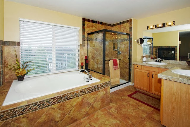
Master bath:
Cleared off the counters,
added some florals, candles,
tossed the ficus,
hung some towels.done.
Now, the Basement.
It. was. full.of. stuff.
We gave homeowners a short list:
remove everything but the things you see in the pics below.
NO Before pics of it, so you'll have to imagine it chock full of
furniture, toys, another ficus tree (@#$%!!!),
and random stuff--probably alot like your basement is right now.
This is what we let them keep:
Two easy chairs and a side table facing a huge wall unit w/ TV.
A foosball table.
A billiards table
and dining set.
That's it.
A secondary bedoom AFTER:
Unfortunately, I don't have BEFORE pics of this room,
as it had the bed you see,
a crib, black-out drapes, pink and brown bedding
for a grandchild.
Everything went but the bed, a bookcase, and that dresser.
We added the bedding and pillows.
The mural stayed.
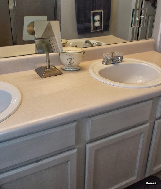
Ok this is a main floor bathroom BEFORE.
I didn't take an After,
but I show this anyway because it was dated looking--
the colors, the walls, the style.
The homeowners painted the room a complimentary color to match the main floor,
removed all the dated accessories,
and we staged it with our black and red and yellow themed accessories.
It looks great.
Ok the last room BEFORE:
It was an office/bedroom...what you can't see is a super long desk on the same wall as the bed.
We suggested they make a decision about what the room should be staged for, and yes, paint it a neutral color of their choice.
They did.
Selling season is just about over--
but for those of you thinking about putting your home on the market,
I hope these photos and tips help you get in the mindset
that your home is a Product to Be Sold.
Pack up your excess,
Paint over your unique custom colors,
and for cryin' outloud
Buy Some Lamps!


